Figure 6.1. Gamut comparison of DLP, CRT, and print film in a chromaticity diagram.
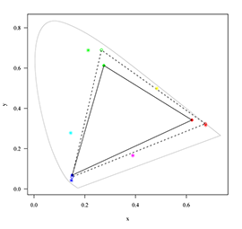
The horseshoe shaped outline represents the spectral colors. The closed circles and the triangle drawn in solid lines represent the color gamut of a CRT monitor. The open circles and the triangle drawn in dashed lines represent the gamut of a DLP projector. The asterisks mark the locations of the red, yellow, green, cyan, blue, and magenta color of a typical motion picture print film projected with a Xenon lamp.
Figure 6.2. Gamut comparison of DLP, CRT, and print film in CIELAB space.
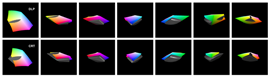
The color gamut of print film is the solid gray form. In the top row it is compared with the gamut of a DLP projector rendered in color. In the bottom row it is compared with the gamut of a CRT monitor, which is rendered in color as well.
Figure 6.3. Rendering of print film colors on a CRT monitor.
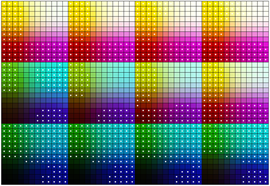
The figure shows a set of 12x12x12 motion picture print film colors displayed on a CRT monitor. The colors marked with a white point cannot be accurately reproduced on the monitor, they are outside of the monitor’s gamut.
Figure 6.4. Rendering of print film colors on a DLP projector.
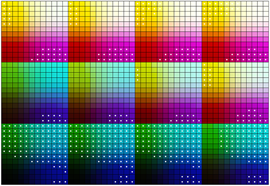
The figure shows a set of 12x12x12 motion picture print film colors projected with a DLP projector. The colors marked with a white point cannot be accurately reproduced with the digital projector, they are outside of the projector’s gamut.
Figure 6.5. Scene in print film contrast rendering.
This is the result of applying the transfer curve (Figure 5.4) to the DPX scan (Figure 3.6). The grayscale characteristic is the same as in Figure 1.1, but the colors look too saturated.
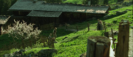
Figure 6.6. Grayscale versus color matching.
While the two versions of the scene have very similar grayscale characteristics, the colors look different.
Figure 6.7. LUT
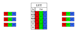
In a LUT each input value is processed without looking at the values of the other color channels. In the example the red input value “50” is transformed to “70” no matter what the values in the green and blue channels are.
Figure 6.8. 3D LUT
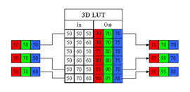
A 3D LUT defines for each input color triple an output triple, in the example the red input value “50” is transformed to three different output values depending on the green and blue values.
So far we have mostly looked at the grayscale characteristics of motion picture film and display devices. Now we need to look at the color[2] properties as well.
Can all possible colors of motion picture print film be reproduced on a monitor or on a DLP projector? Is the color gamut of print film larger or smaller than the gamut of a digital display? The answers to those questions are no and neither.
The color gamut is the set of colors that can be represented in a digital display, in a print film, or in a reflection print. Each of those media has a different gamut, that is, some colors seen in a projected film cannot be reproduced on a computer monitor or on a paper print.
Almost all color systems work with three attributes, a color may be described as an additive mixture of some amounts of red, green, and blue light or as a subtractive mixture of cyan, magenta, and yellow dyes in certain densities. Other color systems work with attributes of perception like lightness, hue, and saturation. Since there are always three dimensions, one talks about a color space.
The Comission Internationale De L'Eclairage (CIE) has established a family of color spaces, which are used to specify colors independently from the medium in which they are generated. One of those color spaces is the CIEXYZ space. Imagine a specific hue of green for example, which appears on a motion picture print film, a computer monitor, and a paper print. The numbers describing the CMY dye densities or the RGB values of that color will be different for each sample. But if all three samples look identical to a human observer they will have the same XYZ values assigned to them.
Therefore, the CIE color spaces are useful to compare the gamut of different media. A common way to do this is to plot the xy-coordinates[3] of the primary colors in a so called chromaticity diagram, as shown in Figure 6.1. The horseshoe shaped outline represents the spectral colors. All colors visible to humans fall into this area. The closed points mark the locations of the red, green, and blue primary colors of a CRT monitor. All colors the monitor can produce fall into the triangle between those points. The open circles and the triangle drawn in dashed lines represent the gamut of a DLP projector.
The color mixture in print film, unlike in monitors and DLP projectors, is not additive but subtractive. With subtractive mixture the color gamut in a chromaticity diagram is rather a hexagonal shape than a triangle. The asterisks in Figure 6.1 mark the locations of the red, yellow, green, cyan, blue, and magenta color of a typical motion picture print film (in additive color mixture, the yellow, cyan, and magenta colors fall onto the lines between the primary colors).
The problem with chromaticity diagrams is that they show only two thirds of the picture. As explained before, there are always three attributes needed to describe colors. The chromaticity diagram ignores the lightness and can therefore lead to wrong conclusions. Looking at Figure 6.1 you might assume that the color gamut of a CRT is completely enclosed by the gamut of print film, but the situation is not that simple.
For a thorough comparison of color gamuts, one has to look at all three dimensions of color. To compare print film with monitor and DLP projector the CIELAB space is used in Figure 6.2. This color space is derived from the XYZ color space and represents colors in terms of lightness and two opponent color directions (red-green and yellow-blue).
Now, one can see the full picture. Motion picture print film has a wider gamut in the darker colors, especially in the blue and cyan hues. DLP and CRT monitor can produce more saturated bright colors in the red, green, and blue hues, but they cannot reproduce the yellow of print film, although the DLP does a better job than the CRT. The results have some consequences for the DI process, which are discussed in the section about color encoding.
Another way to illustrate the color gamut differences is presented in Figure 6.3 and Figure 6.4. A set of 12x12x12 equally spaced density values is recorded to negative film, printed, and the resulting colors are measured. The colors that are outside of the gamut of the digital display are marked. Again, one sees that many of the blue and cyan hues can not be accurately reproduced.
Looking at the gamut of CRT and the DLP one realises a large improvement in the latter and wonders if future technologies will bring out a digital display that can reproduce all colors of print film. The chances are that it will not happen. Principal differences exist in the performance of additive and subtractive color mixture. Subtractive mixture reaches the maximum saturation of colors in lower lightness levels. So when Digital Cinema becomes the primary release form it certainly will change the look of feature films: more saturated bright colors, less saturated darker colors.
If the sample image was displayed with the transfer curve developed in the previous chapter (refer to Figure 5.4) the result would look like in Figure 6.5. The image has the same grayscale characteristics as Figure 1.1, but the colors look wrong. Even without having seen the reference print one would consider the turf as much too saturated (nowhere could a man walk among leaves so green).
Transfer curves like the one in Figure 5.4 are usually implemented as a lookup-table (LUT). As depicted in Figure 6.7, a LUT defines for each input code value an output code value. A LUT may have three channels to handle the red, green, and blue values differently, but each color value is processed without looking at the values of the other color channels. It is not possible to adjust the contrast of RGB images without changing the saturation as well. The monitor transfer function increases the contrast of the DPX scan to match the projected print film. At the same time the saturation is increased to a level higher than in the print film. This is illustrated in Figure 6.6
By comparison, a three-dimensional lookup-table (3D LUT) defines for each input color triple an output triple, see Figure 6.8. Therefore, a 3D LUT can render images where all three attributes of color are controlled independently: lightness, hue, and saturation. For correct rendering of grayscale and colors a 3D LUT is needed.
A 3D LUT for matching the display of DPX files on a computer monitor to print film was used to produce Figure 1.1.
In order to built a 3D LUT one has to measure the colors generated by a set of code values on monitor and on print film. Measuring is usually done in the CIEXYZ color space. The effort in generating a 3D LUT is caused by the fact that the number of colors grows with the third power of the number of points in each channel. For its custom calibration service ARRI uses 123 = 1728 different colors. The color set is displayed in Figure 6.3 and Figure 6.4.
Figure 6.9. DI work flow based on log encoded image data.
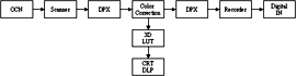
The entire work flow is based on Cineon/DPX files. They are the input to and output from the color correction application. Only for viewing purposes is a display LUT used that mimics the non-linear characteristic of print film.
Figure 6.10. DI work flow based on video encoded image data.
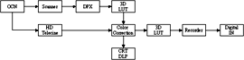
“Video encoded” does not necessarily mean the images are stored on a video device. The important point is that the images are displayed directly on the display without a display LUT, so the image data represent colors in the gamut of the display instead of the gamut of film.
Figure 6.11. Scene graded as “day for night” in log encoding.
Since the image data is a linear representation of (log) scene luminance the tonal scale can be moved over a wide range.
Figure 6.12. Scene graded as “day for night“ in video encoding.
In video images, where the data is not linear to the scene luminance, it may be difficult to restore the compressed tonal values.
Figure 6.13. White points of video and film.

The image on the left hand side represents the white point used in video systems, which is 6500 K. It is assumed that your monitor is adjusted to that color temperature. The next image is the white point of a film projector according to SMPTE 196M (5400 K). The image on the right hand side is the white as seen by an observer adapted to the conditions in the screening room.
Reading the previous section one may wonder whether color information in the negative film is lost in the DI process. Another question is, what happens with the colors of a CRT or DLP that cannot be put on film?
There are two principal methods of image encoding in the DI process. The first one is illustrated in Figure 6.9. The original camera negative (OCN) is scanned as DPX files, which are loaded into a color correction application. To display the images on a CRT or DLP, the application transforms the image data, typically with a 3D LUT as described in the previous section. This transformation is done on the fly while the images are displayed, it is not rendered permanently into the data. The result of the color correction is saved in DPX files again for recording to film. If the 3D LUT produces a good match the prints from the digital IN will look like the images seen on the DLP projector. So what happens with the colors of print film that are outside of the gamut of the DLP? They are not lost since the DPX format carries negative film densities. The 3D LUT will approximate those colors with colors from inside the DLP gamut. This can bee seen in Figure 6.4. It is worth it to point out that the out-of-gamut colors do not constitute a large portion of the colors in natural scenes. In most cases the digital image will be a close approximation of the results on print film. There do remain some uncertainties for the colorist and test recordings may be necessary to find the wanted look. It may be a good practice to record a few feet of an image like in Figure 6.4, print it, and compare the result with the digital display of the same image.
A principally different DI work flow is shown in Figure 6.10. Here the film is transferred to digital realm with an HD telecine or, alternatively, DPX files from a film scanner are converted to video images. That does not necessarily mean the images are stored on a video device like a disk recorder or a VTR. The important point is that the images are displayed directly on a monitor or a DLP without a display LUT. Therefore, the image data represent colors in the gamut of the display instead of the gamut of film. It is the task of the colorist working on the telecine to create a good reproduction. The final color correction is either done during the transfer or a so called best-light transfer is used for further sessions. Finally, the color corrected images have to be transformed into negative densities for recording on film. This transformation can be carried out by the ARRILASER software for example.
In this process colors specific to print film may be lost, because it is difficult to restore them once they are mapped to their approximations in the display gamut. In addition, the colorist may create colors that are visible on the digital display but not on film. Some applications provide an out-of-gamut warning where those colors are highlighted in the image. By comparison, the first method described above only can generate colors that are reproducible on film, because the DPX files encode negative densities and the 3D LUT constrains the gamut of the display where it extends the gamut of print film.
The film laboratory’s color correction is easily simulated in DI if log encoded images are used. When the printer lights are incremented, by 2 points for example, the exposure of the print film is increased by 0.05 log E; the print will become darker. The same result would happen if the negative was 0.05 log D less dense. Hence, we can simply subtract the equivalent number of code values (500*0.05 = 25) from a DPX file to achieve the same effect. Printer corrections to change the color balance of an image work in the same way. Let us assume the red printer light is incremented by 2 points. This will increase the red-absorbing, that is cyan, dye density in the print; it will look less red or more cyan. Subtracting 25 code values from the red channel of the DPX image will alter the color balance in a very similar way. Large alterations of the printer lights are not so easily represented as digital values. That is because the primary colors of the optical printer are not perfectly selective. Changing the red printer lights by a large amount will also affect the green-sensitive, magenta-dye-forming layer.
Naturally, the DI process offers much more than the printer light color correction. Otherwise, the whole venture would not make sense, would it? DI colorists can bend the gradation curves in any way, change hues and saturation, lighten or darken parts of the image. The possibilities are almost endless, but it may be a good idea to start with the simple RGB offsets to align lightness and color balance of the shots. This gives similar results as the DOP would see on an answer print. Take it from there wherever your creative mind wants to go.
Another advantage of the primary RGB correction is that it is easily reproducible in any software. Once colorist and DOP have defined the basic look of each shot in a sequence, the RGB offsets can be passed to the VFX department. Virtually all VFX software packages can add or subtract an offset from an image. Therefore, the VFX artist can have the elements of a composite displayed with the correct lightness and color balance. This is the digital replacement for the match clips used in traditional movie post production.
Now, we are able to reveal the full history of the image displayed inFigure 1.1. It was scanned with an ARRISCAN film scanner as 10 bit DPX file. Color correction was done by adding the equivalent of 3 printer lights in all channels to show more details in the shadows. One printer light in blue was subtracted to balance the color (the total correction is +3, +3, +2). The color corrected image, still in 10 bit DPX format, was processed with a 3D LUT and the output rounded to 8 bit. The 3D LUT has been generated for the DI department at ARRI Film & TV to match the display of DPX files on a Sony GDM 900 CRT monitor to the projection of a print on Kodak 2383 Vision film.
To summarize the results of the last two chapters, we present a somewhat artificial example. Imagine, after scanning the scene in Figure 1.1 the director decides that the footage should be used as “day for night”.
This is a technique used in cinematography for shooting exteriors in daylight and making them look like a night shoot. Traditionally, it involves underexposing by two stops and using a filter to provide a tint, which is often a lavender-blue.
In the DI process based on DPX files the image is corrected by the equivalent of -9, -10, -6 printer lights. At the same time the gamma is reduced to bring back some details in the shadows. The result is presented in Figure 6.11.
In the DI work flow based on video files, offset, gain, and gamma controls were used to match the previous result. But we encounter some difficulties since the non-linear function is already rendered into the image data. Once the shadows and highlights of an image are compressed it may become hard to change the look, at least when a dramatic change is required. As can be seen in Figure 6.12, there is less detail in the shadows and highlights because the tonal compression was introduced before the final color correction. Certainly, a skillful colorist could produce a better result, but he or she would have to find a way to revert the transfer curve applied to the image before.
Motion picture film has some attributes which cause notorious problems in DI and VFX. Photographing perfectly neutral objects will not result in equal densities above base in the negative. Consequently, recording equal RGB values on a film recorder will not produce neutral grays in a print made from the recorded negative. This is a fundamental difference compared to the world of computer or video images, where equal RGB values are neutral by definition.
As long as the display system produces a good match between the digital preview and the print film the colorist can handle the problem. Admittedly, it is difficult when coming from video color correction. The color balance of an image may, for example, change from bluish to yellowish when the overall lightness is increased.
If film survives long enough manufacturers may produce negative and print film that are better suited for digital post processing. Some post production facilities have started to work in an idealized film color space, where equal code values represent neutral colors. They are using transformations at both ends, scanner and recorder, to compensate for the real-world film characteristic.
Another group of problems in digital film work is related to the differences in viewing conditions and color temperature between film and video. Video or computer images are normally placed in front of an illuminated background compared with the dark surround in a projection room. As discussed before, the surround influences the perceived contrast of an image.
The white point of video is 6500 Kelvin compared with 5400 K in a film projection, which looks considerably warmer in a side-by-side comparison where the observer is adapted to the video color temperature. In a dark screening room the observer will adapt to the color temperature of the projector but because of missing visual references the adaptation will only be partial. Therefore, the white of projected film is perceived as warmer than the white on a video monitor; this is illustrated in Figure 6.13.
From our experience in setting up color correction rooms we can only suggest matching the viewing conditions of the final output, and this is the screening room, as close as possible. Switch off any background lights, turn the monitor or the DLP to a white point of 5400 K, and use a lamp with the same color temperature to illuminate the colorist’s desktop, keyboard, and control panel.
-
The set of colors that can be represented in a medium is called color gamut.
-
The color gamut of motion picture print film has a different form than the gamut of a digital display like a CRT or a DLP. The gamut of print film is wider in the darker colors, especially in the blue and cyan hues. DLP and CRT monitor can produce more saturated bright colors in the red, green, and blue hues, but they can not reproduce the yellow of print film.
-
DLP projectors have a larger gamut than CRT monitors.
-
A three-dimensional lookup-table (3D LUT) can be used to display digital images that match the grayscale and colors of print film. Colors that are outside of the display gamut are approximated with colors from within the gamut.
-
There are two principally different methods of image encoding in the DI process.
-
One uses DPX files, which represent negative film densities, as input and output. A display LUT is used to render a preview of the data.
-
The other method works with data that is directly displayed without using a LUT. The image data represent colors in the gamut of the display instead of the gamut of film. The data needs to be converted into density values before it is recorded to film.
-
-
The laboratory’s color correction with printer light adjustments is easily simulated in the DI process.
-
Changing the look of a scene, after a tonal compression has been applied, may be difficult.
-
Negative and print film are not RGB balanced, meaning equal RGB values do not represent neutral colors.